 English
 Russian
Ethereum (ETH) liquidation heatmap
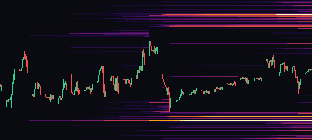
A modelled map of ethereum liquidation clusters: the zones where traders' forced-exit prices sit. The white line is the price path, the labels on the right are levels.
Nearest large clusters
| Level | Size |
|---|---|
| 2,635 | $298M |
| 2,613 | $265M |
| 2,641 | $257M |
| Level | Size |
|---|---|
| 2,802 | $285M |
| 2,783 | $245M |
| 2,799 | $244M |
How the liquidation map differs from the order book
This is a model, not real orders: forced-exit levels are derived from the leverage ladder (50x ≈ 2% from entry, 10x ≈ 10%). A large cluster is a cascade zone. Compare it with the order book: when a cluster lines up with a wall, the level counts double.
How to read the liquidation map
A liquidation is the forced closing of a leveraged position when the trader runs out of collateral. The exchange does not ask for consent: it sells the long or buys back the short at market. One liquidation means nothing, but they gather into clusters, because thousands of people enter at similar levels with similar leverage. The map shows where those clusters sit.
Why price gravitates towards them. Liquidating a long is a market sell, which pushes price lower and triggers the next liquidation. The result is a cascade: one move feeds itself until the positions run out. That is why a large cluster acts as a magnet — not because of a conspiracy, but because forced liquidity is concentrated there for someone to take.
Leverage and distance. The higher the leverage, the closer the liquidation level sits to the current price: 100x positions close on a move of about one percent, 5x positions on a move of twenty. The leverage range on the map is adjustable: a narrow high-leverage range shows nearby clusters, a wide one shows the market-wide picture.
This is a model, not a fact — and that matters. Exchanges do not publish where participants' positions sit; nobody provides that data. We estimate the levels from accumulated volume and a leverage range. A computed level coinciding with a real cascade is probabilistic. Any service promising you “traders' exact positions” is either computing the same kind of model or selling you a confidence it does not have.
How to use it in practice. A cluster is not a target and not a forecast; it is a zone where a move can accelerate. It is most useful together with the order book heatmap: if there are no large limit orders below price and a dense liquidation cluster at the same time, a fall in that direction meets little resistance. If the cluster is shielded by a large wall, the path to it costs more than it looks.
Three mistakes almost everyone makes. The first is treating a cluster as a promise — “price will definitely go there”. It will not necessarily, and it owes you nothing. A cluster only says that if price does arrive, the move may get sharper. The second is reading the map without regard to the leverage range: nearby 100x clusters live for minutes, distant 5x ones may not trigger for months. The third is confusing liquidations with ordinary stop-losses. A stop is set by the trader and can be removed; a liquidation is executed by the exchange and asks nobody.
Why clusters build up below price in a rising market. When the market has been rising for a while, most positions are leveraged longs, and their liquidation levels sit below the current price. Hence the familiar pattern: a slow grind up and a sharp drop that looks “unprovoked”. Usually the drop simply passed through a dense zone of forced selling. In a falling market the picture mirrors: density gathers above, and the market travels in sharp squeezes upward.
What to look at alongside the map. Realised liquidations over the past day are a fact, not a model: the exchange publishes them as a stream. Comparing actual liquidations with computed clusters shows how well the model fits this coin right now. If actual triggers land noticeably above or below the computed ones, the leverage range is worth adjusting.
Viewing the map alongside candles, the order book and indicators is easier in the terminal. The model's assumptions are listed on the methodology page.
Frequently asked questions
What is a Ethereum liquidation heatmap?
It shows the price levels where leveraged ETH longs and shorts would be closed by force. Bright bands are levels where a lot of leverage has piled up. When price reaches them, exchanges close those positions with market orders, which pushes price further in the same direction.
How do I read the ETH liquidation map?
Clusters below the current price are long liquidations: if price falls into them, longs get closed and selling speeds up. Clusters above are short liquidations, the fuel for a short squeeze. The brighter the band, the more money sits there. The nearest large cluster on each side is where a move is most likely to accelerate.
How accurate is the liquidation heatmap?
Centralised exchanges do not publish each trader's liquidation price, so the map is an estimate built from open interest, typical leverage and entry levels. Read it as a map of likely zones, not exact prices. On Hyperliquid positions are public, and there we show real liquidation levels by wallet.
What is the difference between a liquidation map and an order book heatmap?
The order book heatmap shows limit orders that are actually resting in the book. The liquidation map shows where forced market orders would appear if price gets there. One is liquidity that exists now, the other is liquidity that a move would create.
Does price always reach the liquidation clusters?
No. Large clusters often pull price toward them, because triggering them is profitable for big players, but news, spot flows and funding can turn the market the other way. Check the order book, funding rate and open interest before acting on a cluster.
Is the ETH liquidation heatmap free?
Yes. It is free, needs no sign-up and refreshes as new data comes in.